Part 3: We Tested Every Explanation... Here’s What Survived

Part 3 of an ongoing investigation. Part 1 here. Part 2 here. Full paper on Zenodo. Code on GitHub. Globe at thegreatcircle.earth.
In Part 1, we ran the first rigorous statistical test of the Great Circle alignment — the observation that Giza, Nazca, Easter Island, Persepolis, and other famous ancient sites fall near a single circle on the Earth’s surface. The signal was real, replicated across multiple independent databases.
In Part 2, we showed the obvious objection — that the circle just follows geography — doesn’t hold. Ancient monuments cluster at 5× the expected rate. Settlements in the same river valleys and coastlines cluster at 0.78×. Same geography. Opposite result.
That leaves a question: if not geography, what?
We tested ten alternative explanations. One by one. Here’s what happened.
1. It’s a database artifact
Maybe the Megalithic Portal has some internal bias that creates the illusion of alignment. This was the easiest hypothesis to test — use a completely different database.
Seven databases. Different contributors, different editorial standards, different continents of focus. Zero methodological overlap. All show the same signal.
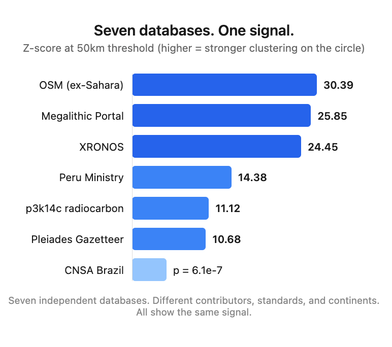
Verdict: Not a database artifact.
2. The circle was optimized to fit the data
Maybe Jim Alison drew the circle to maximize the number of sites it hits. Maybe any circle through populated regions would look this good.
We tested 16,200 pole positions on a 2° grid. Alison’s circle ranks 85th percentile — good, but not the best. The statistical optimum is a circle through Britain and France that catches vastly more sites because that’s where the databases are densest.
But here’s the thing: among 1,718 circles with Alison’s geographic profile — passing through the Middle East AND South America while avoiding Europe — Alison’s ranks #1. The 99.94th percentile.
The circle isn’t the best way to catch the most sites. It’s the best way to catch monuments in these specific regions.
Verdict: Not optimized for raw count. Distinguished by what it catches, not how many.
3. Post-hoc fitting — he drew the line through famous sites
This is the deepest version of the selection bias argument. Alison saw Giza, Nazca, Easter Island. He drew a line. Of course those sites are on it.
So we split the databases by date. Sites known before 2001 (when Alison proposed the circle) versus sites discovered or published afterward.
The pre-2001 data shows essentially no alignment. p3k14c pre-2001: Z = 0.06 — literally random. Pleiades pre-2001: Z = −1.69 — below random.
The post-2001 data — over 100,000 radiocarbon dates published by researchers who had no idea about this circle — shows Z = 17.24 at 50km. Z = 27.26 at 25km.
The alignment got stronger as new data came in.
But we need to be honest about a caveat: that post-2001 signal is concentrated in five regions — Easter Island, Egypt, the Levant, Peru, and Iran. The same regions Alison was looking at. Remove those five grid cells and the signal disappears. Europe and North America, which account for 88% of all radiocarbon dates, contribute zero near-circle dates.
The circle predicts continued discoveries in the regions it was designed to connect. It doesn’t predict discoveries in new regions. That’s real, but it’s not as dramatic as the headline Z-score suggests.
Verdict: The alignment is real and holds up in post-2001 data, but the “prediction” is geographically concentrated in the same regions Alison originally identified.
4. It’s just population density
The circle passes through fertile regions. More people means more sites. Maybe the signal just reflects where people lived.
We tested this directly using HYDE 3.3 historical population density data from 3000 BCE to 1000 CE. Population density along the circle is about 2× average — modestly elevated but not exceptional.
Z = 0.89. Not statistically significant. Population density accounts for roughly 2× enrichment. The monument signal is 5×. Population can’t explain the gap.
Verdict: Population density explains some of the alignment but less than half of it.
5. It’s Bronze Age trade routes
This one seemed promising. The circle runs from Egypt through Mesopotamia to Iran — the world’s oldest long-distance trade corridor. Maybe monuments were built at trading hubs.
We compiled 18,335 sites across seven trade-relevant datasets, including 4,400 p3k14c dates from the Egypt-Iran corridor. We tested whether trade corridor density correlates with the monument-settlement divergence.
Result: Pearson r = +0.04. p = 0.93. Zero correlation.
But it gets better. When we ran the full settlement test on trade-relevant sites, we got D = −4.00. Negative. Settlements cluster on trade routes. Monuments don’t. The Great Circle signal and trade routes produce opposite patterns.
Anatolia — a major Bronze Age trading hub with well-documented connections to Egypt, Mesopotamia, and the Aegean — shows zero overlap with the circle. Zero of 483 professionally classified Bronze Age sites in western Anatolia fall within 500km of the line.
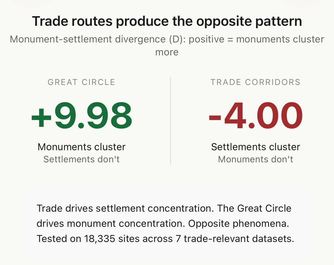
Verdict: Trade routes produce the opposite of the Great Circle signal. Ruled out.
6. The circle tracks a geological feature
Maybe there’s a fault line, a tectonic boundary, or some geomorphological feature running under the circle. We tested the most obvious candidate: the Nile Valley desert-floodplain escarpment, the boundary where pyramids were built.
Using SRTM elevation data, we checked whether the circle follows the escarpment through Egypt. It doesn’t. Only one of five sample points lies near the western desert edge (4.1km). The rest are 107-226km away. Mean distance: 134km. The circle crosses the Nile Valley at a steep diagonal. It intersects the escarpment at one point, like any diagonal line would.
Verdict: The circle doesn’t track the desert edge or any identified geological feature.
7. Astronomical alignment
The circle’s geometry might encode an astronomical relationship — the ecliptic, a stellar azimuth, the galactic pole.
We tested monument orientations within 50km of the circle against the circle’s local bearing, and against stellar azimuths at 2500 BCE. Rayleigh test for clustering: p = 0.75. No significant alignment. All Egyptian monuments are oriented N-S; the circle runs roughly E-W through Egypt. They’re perpendicular.
We also checked the pole location (59.68°N, 138.65°W) against the geographic pole, the geomagnetic pole at 2500 BCE, the ecliptic pole, and the galactic pole. No special angular relationships.
Verdict: No astronomical signature found.
8. Egyptian preservation bias
This is the one reviewers care about most. Egyptian stone monuments survive. Mudbrick settlements dissolve. Maybe the divergence just reflects differential preservation — monuments visible, settlements buried.
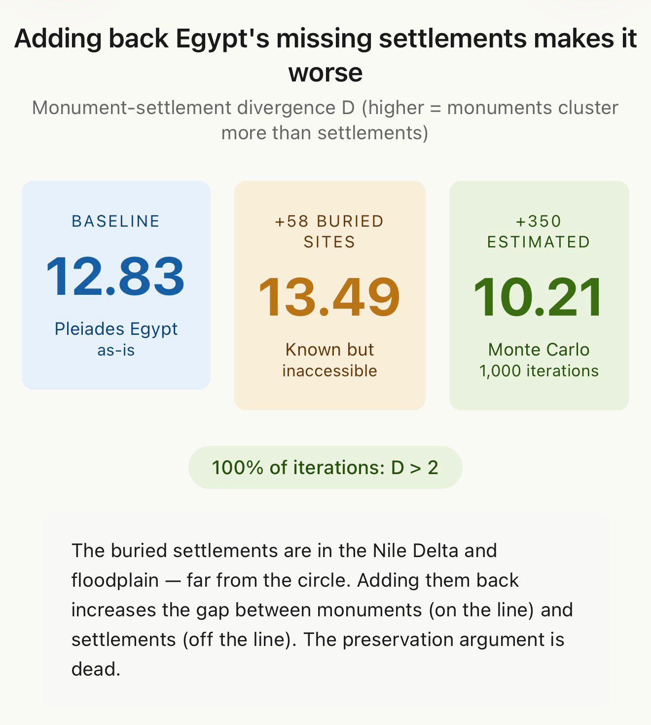
We compiled 58 known-but-buried Egyptian settlement sites from published archaeological literature — sites that exist but can’t be fully excavated because they’re under modern cities, Nile alluvium, or the water table. Memphis under Mit Rahina. Heliopolis under Cairo. Avaris under farmland. Sources: the EES Delta Survey (Spencer, 2024), Moeller (2016), Kemp (2018).
We added them all to the settlement category and re-ran the divergence test.
The divergence increased. From D = 12.83 to D = 13.49.
Why? Because the buried settlements are in the Nile Delta and the floodplain — far from the circle. The circle clips the desert plateau edge near Memphis. The missing settlements are in the wrong place to close the gap.
We then ran a Monte Carlo simulation adding 350 estimated buried settlements randomly within the Nile floodplain. D exceeded 2 in 100% of 1,000 iterations. Mean D = 10.21.
The preservation argument is dead. We tested it. Adding back the missing settlements makes the divergence stronger, not weaker.
Verdict: Preservation bias tested quantitatively for the first time. It doesn’t explain the pattern.
9. The signal extends to South America
We tested whether the monument-settlement divergence appears independently on other continents. Three South American databases:
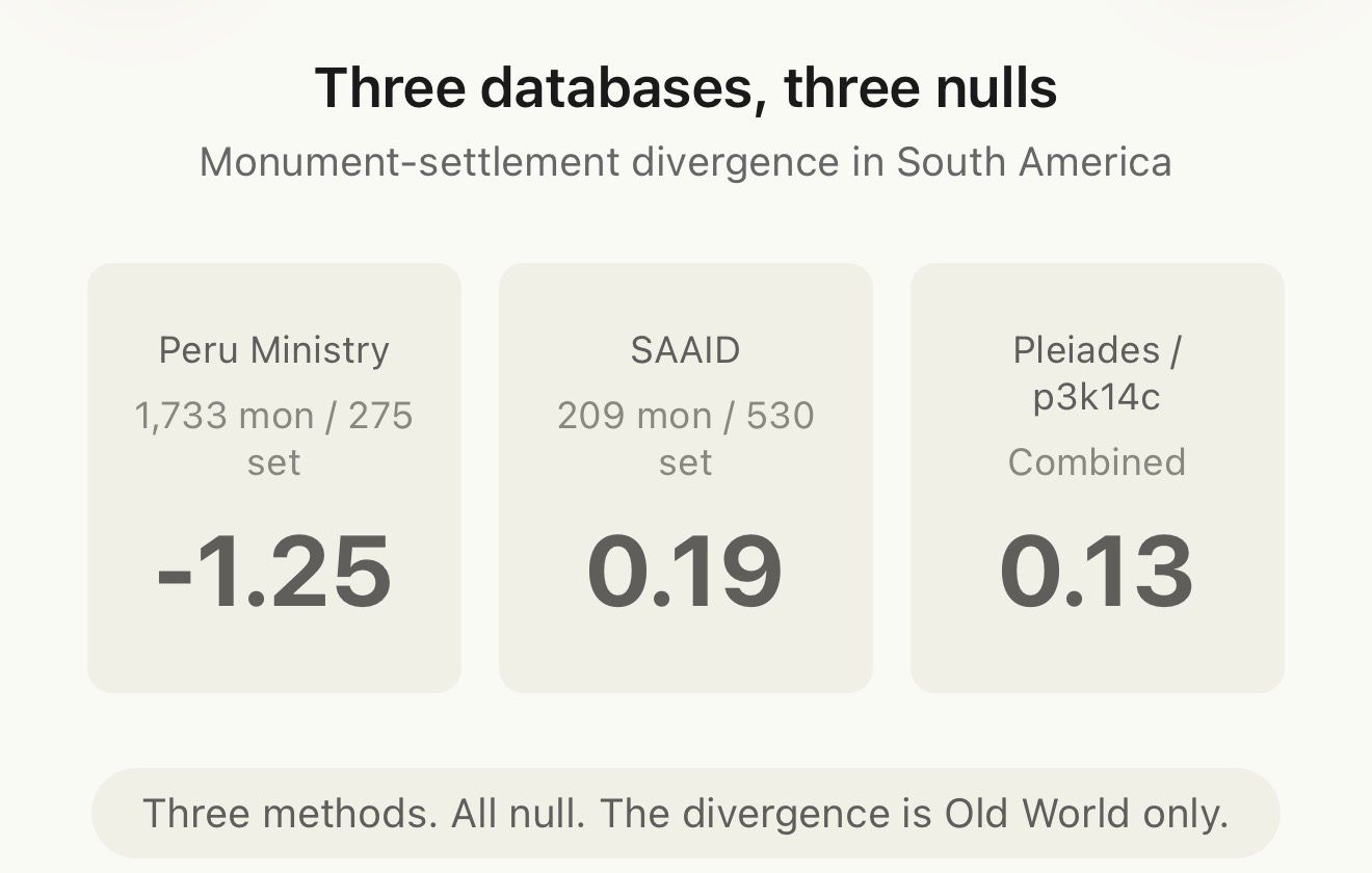
Three databases, three different classification methods, all null. The monument-settlement divergence does not appear in South America.
Verdict: The divergence is specific to the Egypt-Iran corridor. Not a global phenomenon.
10. It’s the Younger Dryas
Graham Hancock proposes that an advanced civilization was destroyed by a catastrophic event during the Younger Dryas cold period (~12,800-11,600 years ago), and that survivors spread knowledge along routes that might correspond to the Great Circle.
Using 170,150 p3k14c radiocarbon dates going back 20,000 years, we tested whether the circle shows any anomalous signal during the Younger Dryas.
It doesn’t. Z = +0.71. Not significant. 43% of random circles show a more extreme anomaly. The Younger Dryas is a non-event along this corridor.
Verdict: No Younger Dryas signal. The circle shows no evidence of disruption or special activity during this period.
What survived
Ten hypotheses tested. Ten addressed. Here’s the scorecard:
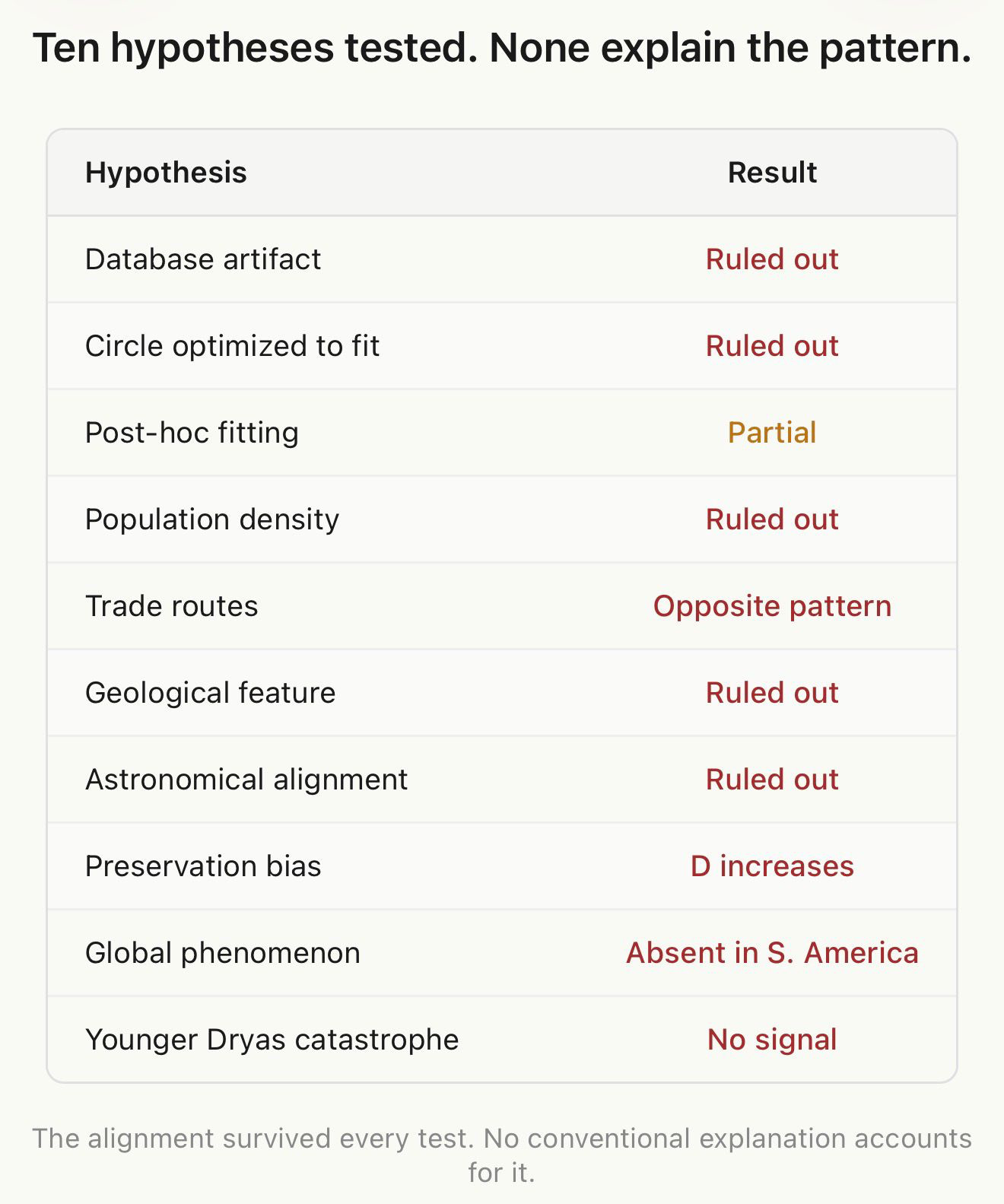
None of these explain the pattern.
But something we didn’t expect turned up in the Younger Dryas test. While the Younger Dryas itself is empty, the period immediately after — Part 3 of an ongoing investigation. Part 1 here. Part 2 here. Full paper on Zenodo. Code on GitHub. Globe at thegreatcircle.earth.
In Part 1, we ran the first rigorous statistical test of the Great Circle alignment — the observation that Giza, Nazca, Easter Island, Persepolis, and other famous ancient sites fall near a single circle on the Earth’s surface. The signal was real, replicated across six independent databases.
In Part 2, we showed the obvious objection — that the circle just follows geography — doesn’t hold. Ancient monuments cluster at 5× the expected rate. Settlements in the same river valleys and coastlines cluster at 0.78×. Same geography. Opposite result.
That leaves a question: if not geography, what?
We tested ten alternative explanations. One by one. Here’s what happened.
1. It’s a database artifact
Maybe the Megalithic Portal has some internal bias that creates the illusion of alignment. This was the easiest hypothesis to test — use a completely different database.
We tested six more. Then seven. Then eight.
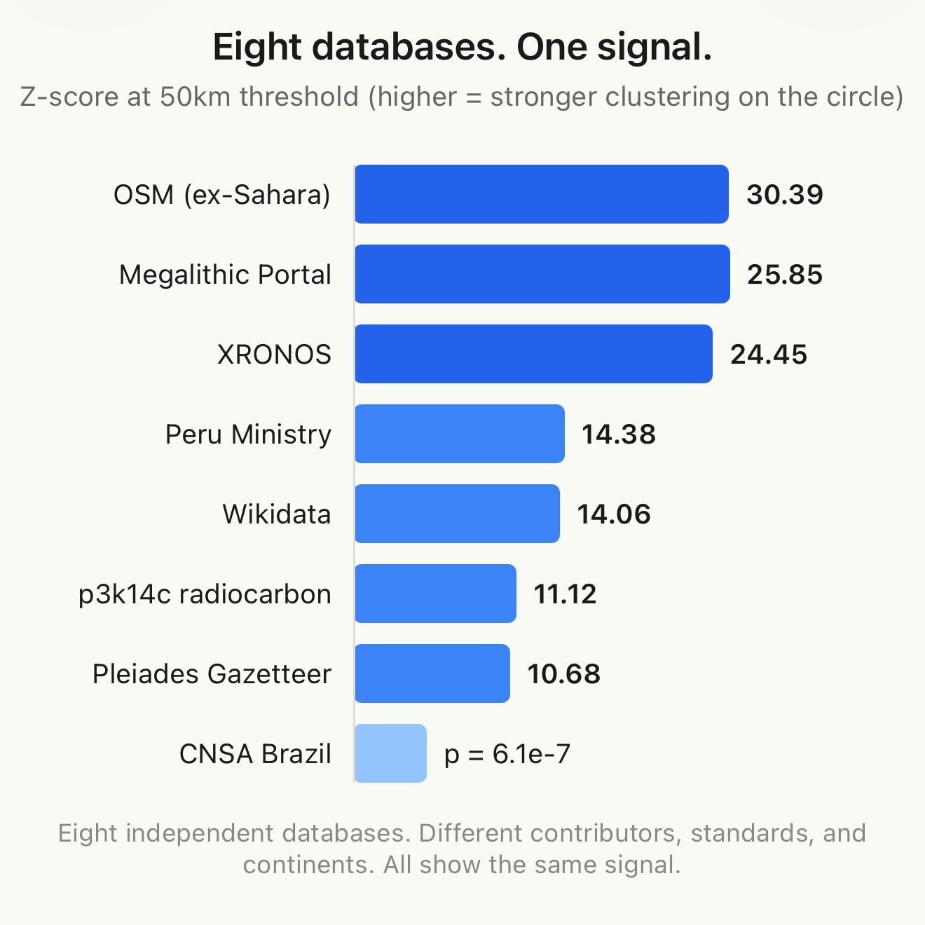
Eight databases. Different contributors, different editorial standards, different continents of focus. Zero methodological overlap. All show the same signal.
Verdict: Not a database artifact.
2. The circle was optimized to fit the data
Maybe Jim Alison drew the circle to maximize the number of sites it hits. Maybe any circle through populated regions would look this good.
We tested 16,200 pole positions on a 2° grid. Alison’s circle ranks 85th percentile — good, but not the best. The statistical optimum is a circle through Britain and France that catches vastly more sites because that’s where the databases are densest.
But here’s the thing: among 1,718 circles with Alison’s geographic profile — passing through the Middle East AND South America while avoiding Europe — Alison’s ranks #1. The 99.94th percentile.
The circle isn’t the best way to catch the most sites. It’s the best way to catch monuments in these specific regions.
Verdict: Not optimized for raw count. Distinguished by what it catches, not how many.
3. Post-hoc fitting — he drew the line through famous sites
This is the deepest version of the selection bias argument. Alison saw Giza, Nazca, Easter Island. He drew a line. Of course those sites are on it.
So we split the databases by date. Sites known before 2001 (when Alison proposed the circle) versus sites discovered or published afterward.
The pre-2001 data shows essentially no alignment. p3k14c pre-2001: Z = 0.06 — literally random. Pleiades pre-2001: Z = −1.69 — below random.
The post-2001 data — over 100,000 radiocarbon dates published by researchers who had no idea about this circle — shows Z = 17.24 at 50km. Z = 27.26 at 25km.
The alignment got stronger as new data came in.
But we need to be honest about a caveat: that post-2001 signal is concentrated in five regions — Easter Island, Egypt, the Levant, Peru, and Iran. The same regions Alison was looking at. Remove those five grid cells and the signal disappears. Europe and North America, which account for 88% of all radiocarbon dates, contribute zero near-circle dates.
The circle predicts continued discoveries in the regions it was designed to connect. It doesn’t predict discoveries in new regions. That’s real, but it’s not as dramatic as the headline Z-score suggests.
Verdict: The alignment is real and holds up in post-2001 data, but the “prediction” is geographically concentrated in the same regions Alison originally identified.
4. It’s just population density
The circle passes through fertile regions. More people means more sites. Maybe the signal just reflects where people lived.
We tested this directly using HYDE 3.3 historical population density data from 3000 BCE to 1000 CE. Population density along the circle is about 2× average — modestly elevated but not exceptional.
Z = 0.89. Not statistically significant. Population density accounts for roughly 2× enrichment. The monument signal is 5×. Population can’t explain the gap.
Verdict: Population density explains some of the alignment but less than half of it.
5. It’s Bronze Age trade routes
This one seemed promising. The circle runs from Egypt through Mesopotamia to Iran — the world’s oldest long-distance trade corridor. Maybe monuments were built at trading hubs.
We compiled 18,335 sites across seven trade-relevant datasets, including 4,400 p3k14c dates from the Egypt-Iran corridor. We tested whether trade corridor density correlates with the monument-settlement divergence.
Result: Pearson r = +0.04. p = 0.93. Zero correlation.
But it gets better. When we ran the full settlement test on trade-relevant sites, we got D = −4.00. Negative. Settlements cluster on trade routes. Monuments don’t. The Great Circle signal and trade routes produce opposite patterns.
Anatolia — a major Bronze Age trading hub with well-documented connections to Egypt, Mesopotamia, and the Aegean — shows zero overlap with the circle. Zero of 483 professionally classified Bronze Age sites in western Anatolia fall within 500km of the line.
Verdict: Trade routes produce the opposite of the Great Circle signal. Ruled out.
6. The circle tracks a geological feature
Maybe there’s a fault line, a tectonic boundary, or some geomorphological feature running under the circle. We tested the most obvious candidate: the Nile Valley desert-floodplain escarpment, the boundary where pyramids were built.
Using SRTM elevation data, we checked whether the circle follows the escarpment through Egypt. It doesn’t. Only one of five sample points lies near the western desert edge (4.1km). The rest are 107-226km away. Mean distance: 134km. The circle crosses the Nile Valley at a steep diagonal. It intersects the escarpment at one point, like any diagonal line would.
Verdict: The circle doesn’t track the desert edge or any identified geological feature.
7. Astronomical alignment
The circle’s geometry might encode an astronomical relationship — the ecliptic, a stellar azimuth, the galactic pole.
We tested monument orientations within 50km of the circle against the circle’s local bearing, and against stellar azimuths at 2500 BCE. Rayleigh test for clustering: p = 0.75. No significant alignment. All Egyptian monuments are oriented N-S; the circle runs roughly E-W through Egypt. They’re perpendicular.
We also checked the pole location (59.68°N, 138.65°W) against the geographic pole, the geomagnetic pole at 2500 BCE, the ecliptic pole, and the galactic pole. No special angular relationships.
Verdict: No astronomical signature found.
8. Egyptian preservation bias
This is the one reviewers care about most. Egyptian stone monuments survive. Mudbrick settlements dissolve. Maybe the divergence just reflects differential preservation — monuments visible, settlements buried.
We compiled 58 known-but-buried Egyptian settlement sites from published archaeological literature — sites that exist but can’t be fully excavated because they’re under modern cities, Nile alluvium, or the water table. Memphis under Mit Rahina. Heliopolis under Cairo. Avaris under farmland. Sources: the EES Delta Survey (Spencer, 2024), Moeller (2016), Kemp (2018).
We added them all to the settlement category and re-ran the divergence test.
The divergence increased. From D = 12.83 to D = 13.49.
Why? Because the buried settlements are in the Nile Delta and the floodplain — far from the circle. The circle clips the desert plateau edge near Memphis. The missing settlements are in the wrong place to close the gap.
We then ran a Monte Carlo simulation adding 350 estimated buried settlements randomly within the Nile floodplain. D exceeded 2 in 100% of 1,000 iterations. Mean D = 10.21.
The preservation argument is dead. We tested it. Adding back the missing settlements makes the divergence stronger, not weaker.
Verdict: Preservation bias tested quantitatively for the first time. It doesn’t explain the pattern.
9. The signal extends to South America
We tested whether the monument-settlement divergence appears independently on other continents. Three South American databases:
Three databases, three different classification methods, all null. The monument-settlement divergence does not appear in South America.
Verdict: The divergence is specific to the Egypt-Iran corridor. Not a global phenomenon.
10. It’s the Younger Dryas
Graham Hancock proposes that an advanced civilization was destroyed by a catastrophic event during the Younger Dryas cold period (~12,800-11,600 years ago), and that survivors spread knowledge along routes that might correspond to the Great Circle.
Using 170,150 p3k14c radiocarbon dates going back 20,000 years, we tested whether the circle shows any anomalous signal during the Younger Dryas.
It doesn’t. Z = +0.71. Not significant. 43% of random circles show a more extreme anomaly. The Younger Dryas is a non-event along this corridor.
Verdict: No Younger Dryas signal. The circle shows no evidence of disruption or special activity during this period.
What survived
Ten hypotheses tested. Ten addressed. Here’s the scorecard:
None of these explain the pattern.
But something we didn’t expect turned up in the Younger Dryas test. While the Younger Dryas itself is empty, the period immediately after — the early Holocene, roughly 8,500 to 6,500 BCE — shows something striking. Radiocarbon dates near the circle are 4 to 6 times more concentrated than the global average during this period. The circle doesn’t just capture where monuments were built 5,000 years ago. It captures where humans were living 10,000 years ago.
We’ll come back to that in Part 5.
For now, here’s what we know: the Great Circle alignment is real, replicated, monument-specific, and temporally bounded. No conventional explanation accounts for it. The pattern survived every test we threw at it.
In Part 4, we’ll look at exactly when and where the monument signal peaks — and find that it’s both more specific and more interesting than we expected.
Full paper: doi.org/10.5281/zenodo.19046176
Code and data: github.com/thegreatcircledata
Interactive globe: thegreatcircle.earth Radiocarbon dates near the circle are 4 to 6 times more concentrated than the global average during this period. The circle doesn’t just capture where monuments were built 5,000 years ago. It captures where humans were living 10,000 years ago.